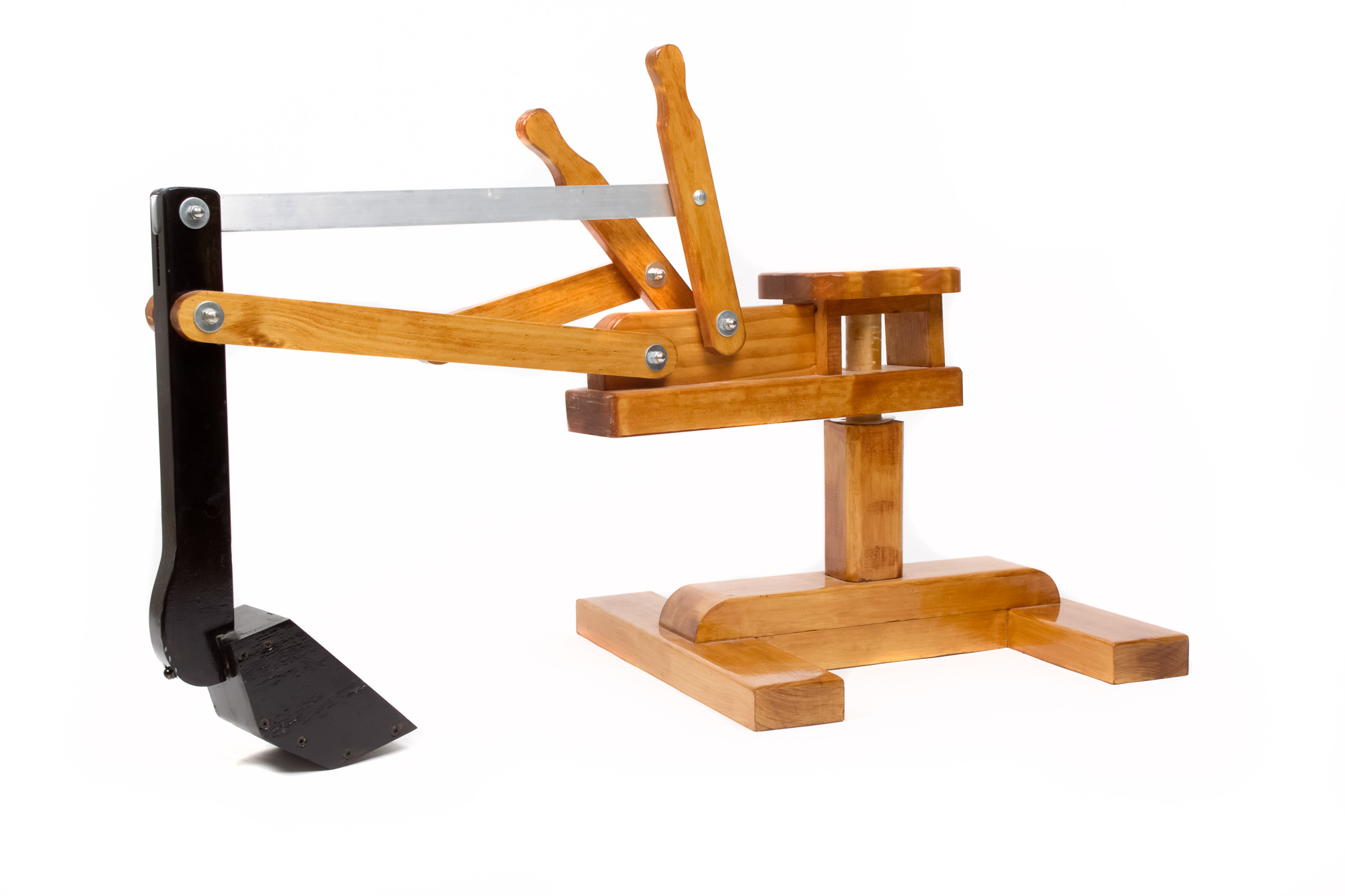
product photography

Velo, Redefining Bike Storage with LP Commercial: Product & Lifestyle Photography for their Website

Taking LOCAL Brisbane Business Innovation to the World, One Bike Rack at a Time

The Team at LP Photography are Amazing! As one of the owners of Velo Pushbike Parking Solutions, I engaged LP Commercial to photograph and video our website build project. Which had some huge challenges to overcome. The level of passion that Em, Andy, Mel, and Colly bring to their work is amazing. Nothing was too difficult!! Overall the Team is very friendly, fun and responsive. Can’t wait to work together again guys! A++
— Cameron Hyde

LP Commercial Photography & Videography recently worked on an exciting product project with Velo Pushbike Parking Solutions encapsulates what we love about collaborating with local businesses.

Velo is redefining the modern bike rack experience with intelligent design and robust quality, transforming the way we store our bikes all over the world.

Velo, designed by Cobra, is a Brisbane-based family business, and it’s all about innovation. In this case, that creativity was put to use designing unique, custom solutions for storing our two-wheeled modes of transport in ways that are easy, secure, and attractive, as well as a simple and easy to use range of accessories.

Their reach extends far beyond the sunshine state too – with orders rolling in from as far as London, having installed 300+ units in Bishopsgate London U.K.

Client Collaboration and Problem Solving

LP loved working alongside Velo in the studio and on location to showcase their whole range in action and as product imagery. Since some of the bike racks were too large to easily transport to a traditional studio, a solution needed to be devised. So, with true problem-solving gusto, Velo built a temporary studio right around the units at their factory!

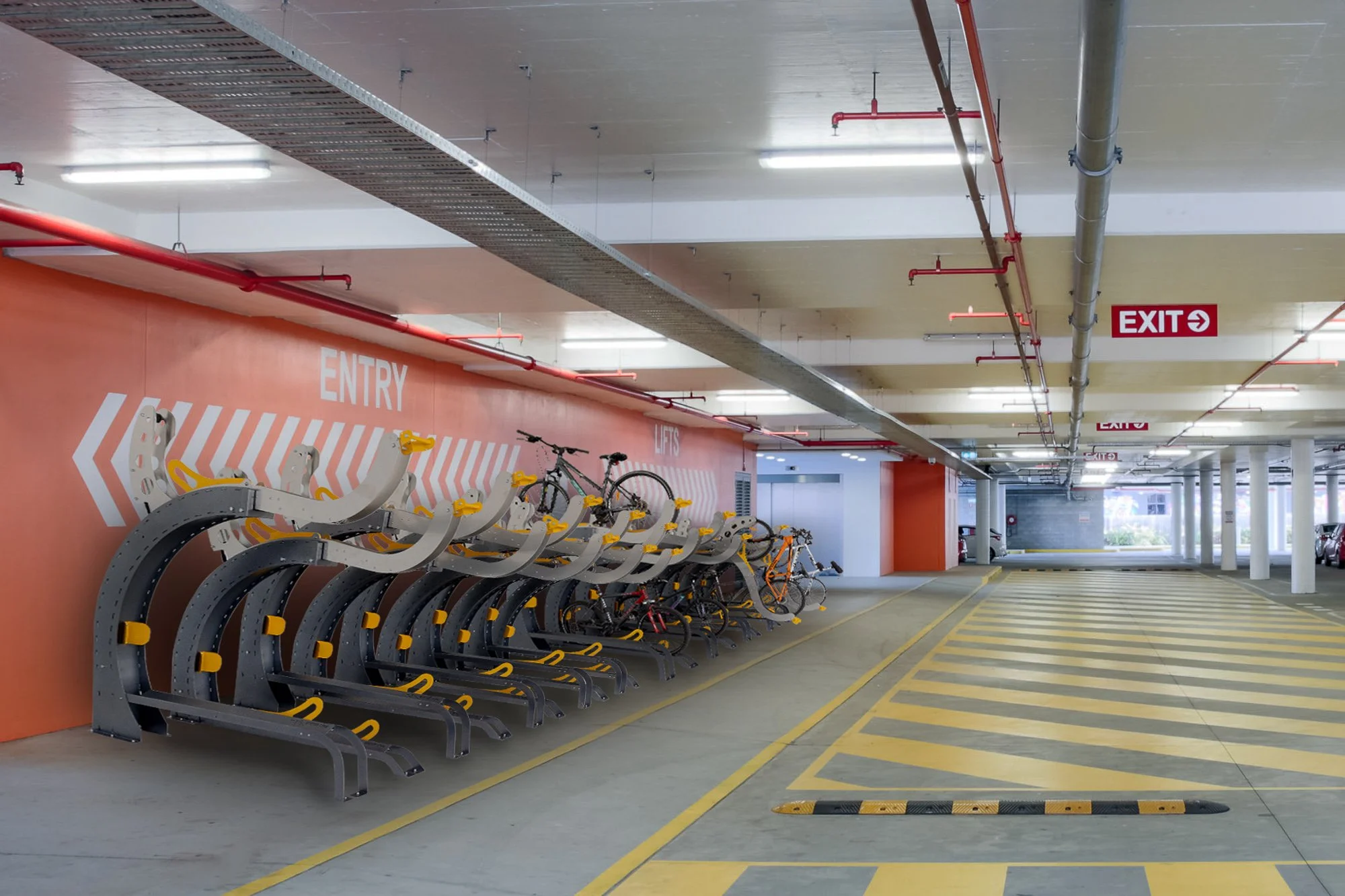
Their bike racks are one a kind! The Arc can store 2 bikes per unit but stacked in a line next to each other they could hold hundreds as seen in one of your videos there is no limit to how many units you could stack next to each other.  

A Cohesive Approach: Video & Stills

In opting for both stills and video, Velo ensured they had marketting material to cover all facets of the business, from social media to their website and beyond.

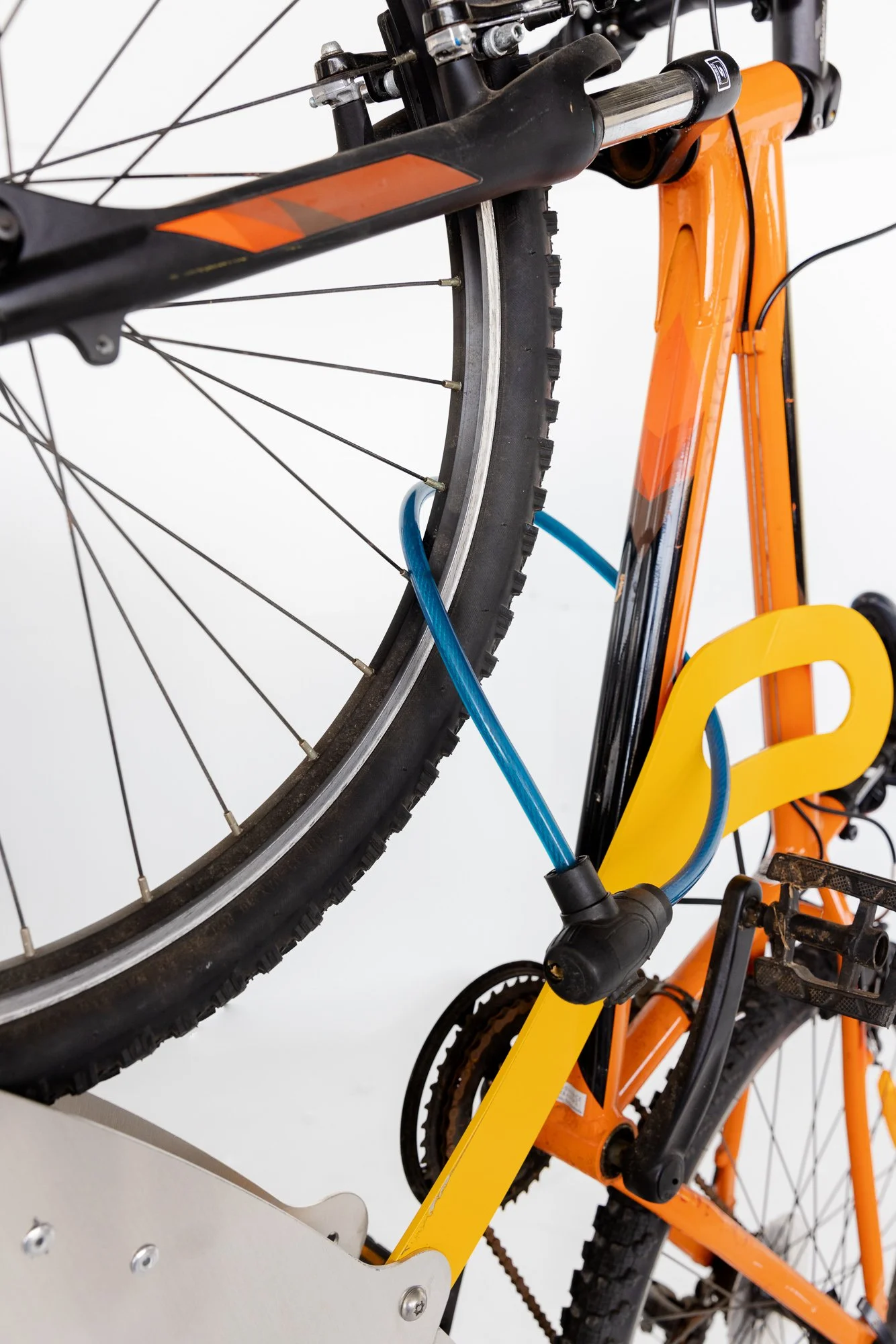
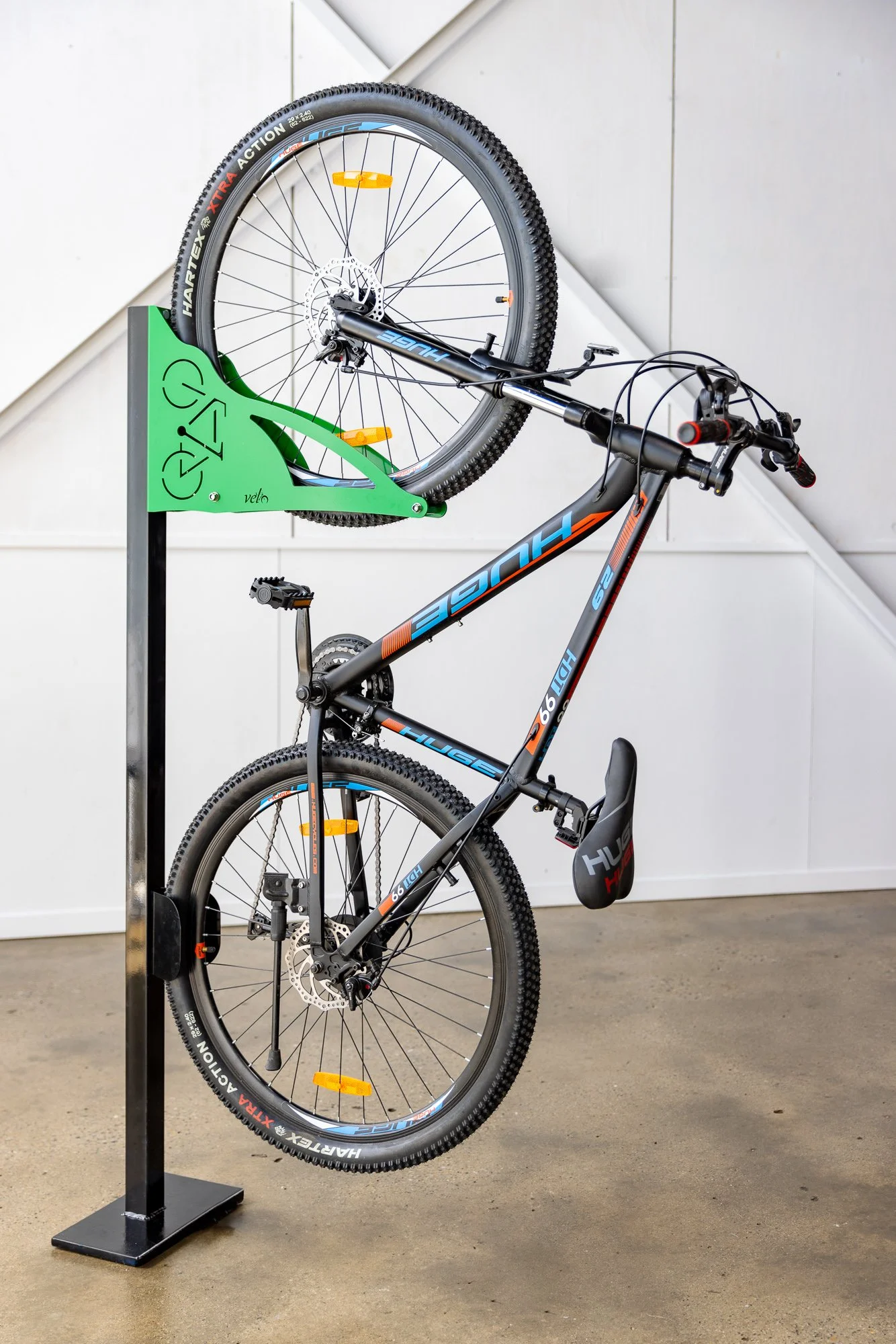
While stills were perfect for capturing the finer details such as the built-to-last craftsmanship and the sleek design, video provided an invaluable angle on how to use and the ease with which bikes can be stored using the racks.

The imagery was captured across three shoot sessions, in which we ensured a cohesive visual style at various locations.

Post-Production Power

In order to save time and cost for our client, human post-production and Ai was utilised to put the bike racks into realistic settings. By placing them digitally into parking environments as well as interiors, we provided a way for potential clients of Cobra to envision what the racks might look like on their own premises.

Meticulous details to correct scale and environment was key here, and in the end, the results speak for themselves.

If you have a product of project that needs a collaborative effort, consider LP and contact us today. We’ll do you up a custom quote, discuss strategies with you, and provide exactly the imagery you need for your business.

See the Velo Bikerack Solutions Website HERE

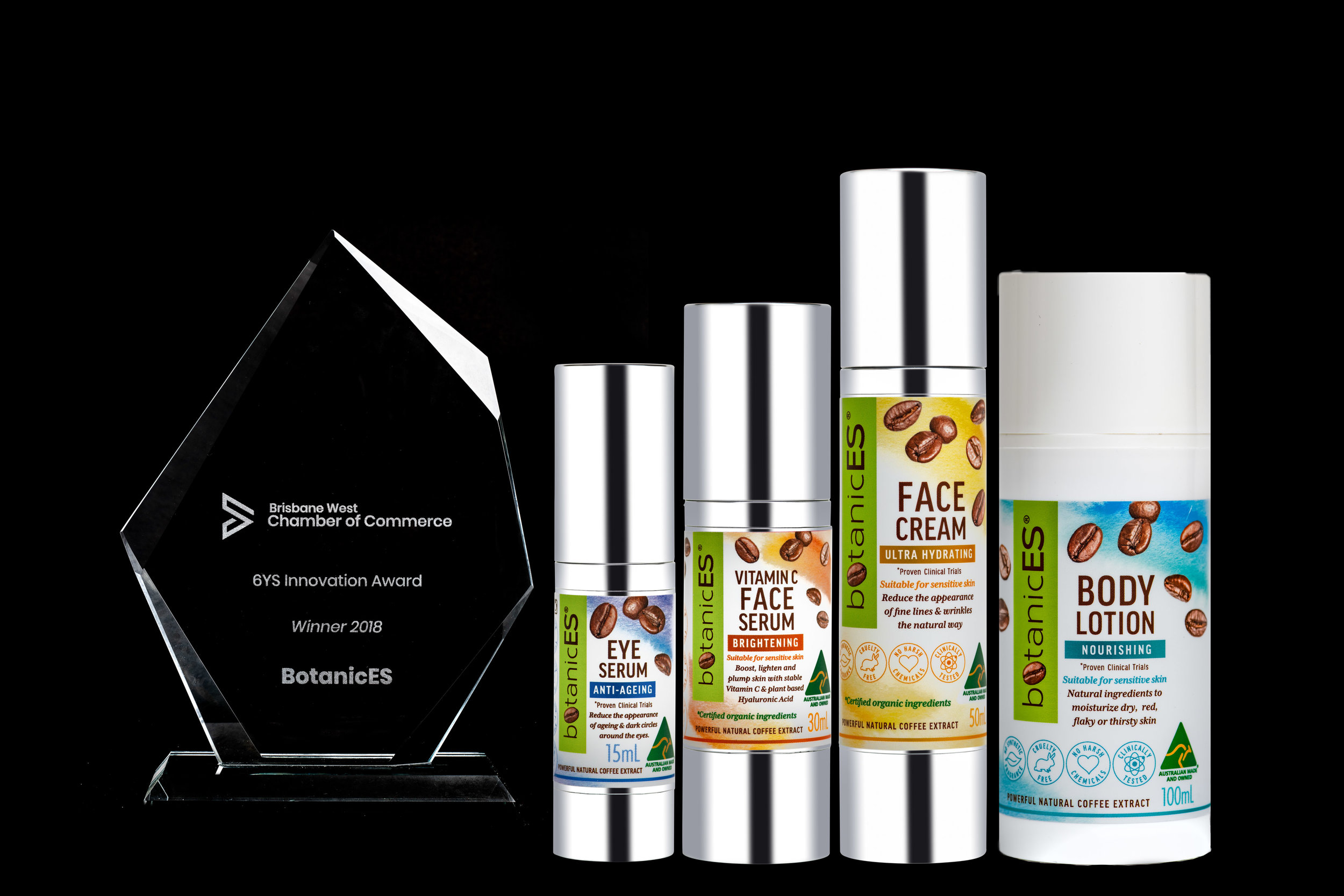
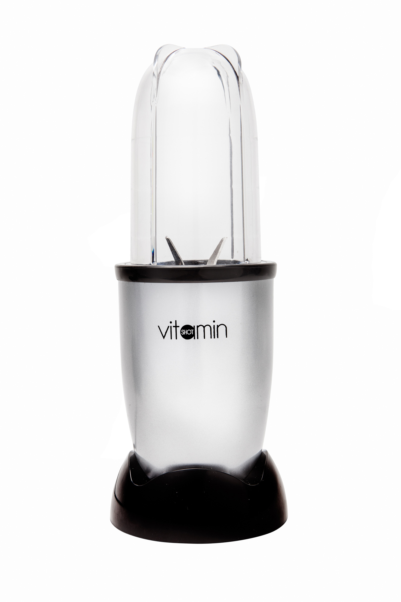
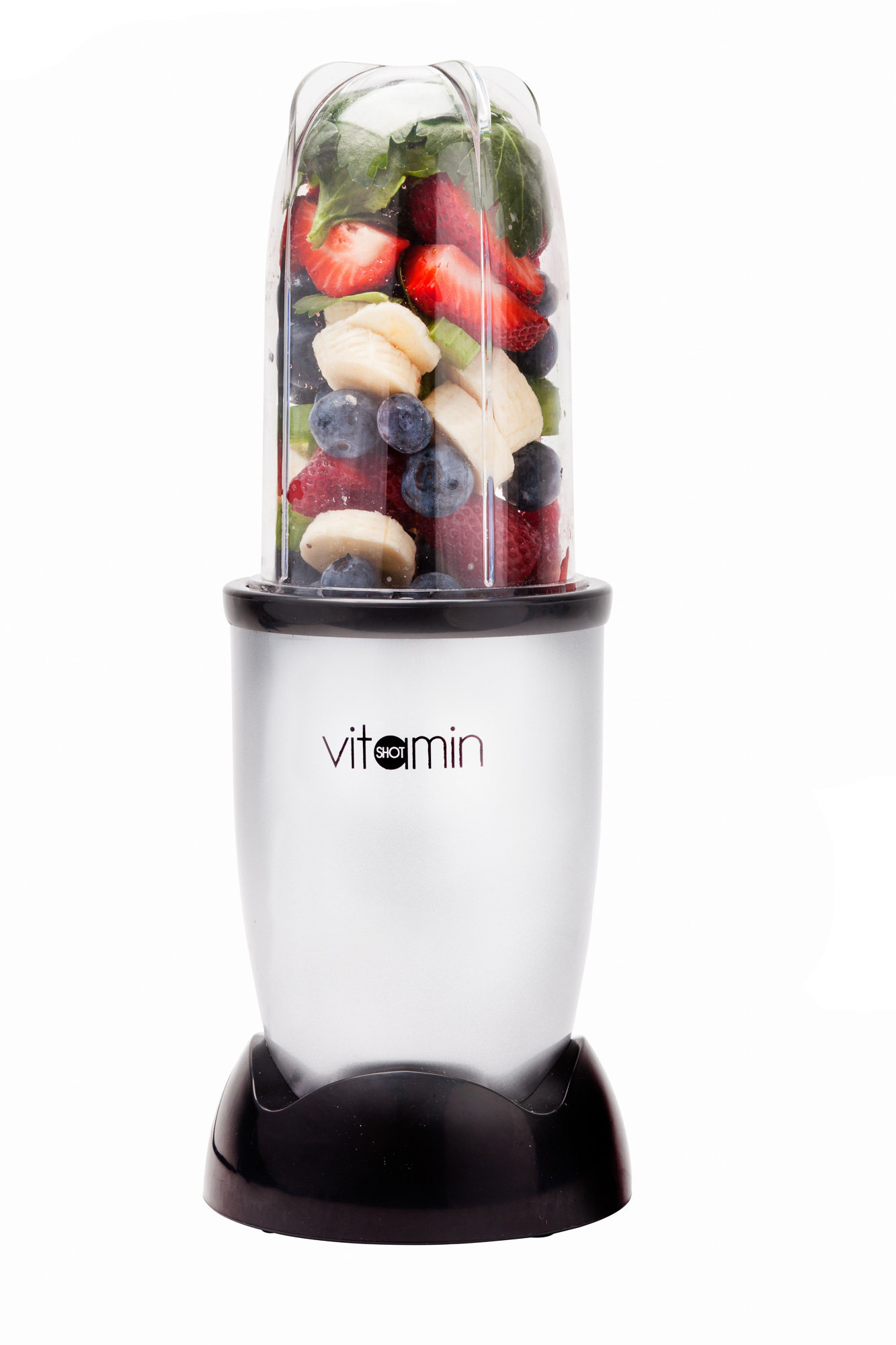
Product Photography - Thinking beyond the box: Brisbane Commercial Photography

Product Photography - Thinking beyond the box: Brisbane Commercial Photography

The humble product photograph gets a bad rap sometimes. Big brands with matching budgets do some amazing work with water splashes, beautiful day long studio sessions for a single image or even hours placing individual sesame seeds on a burger bun by a team of food designers to ensure the most delicious looking food product that simply can’t be replicated in the real restaurant.
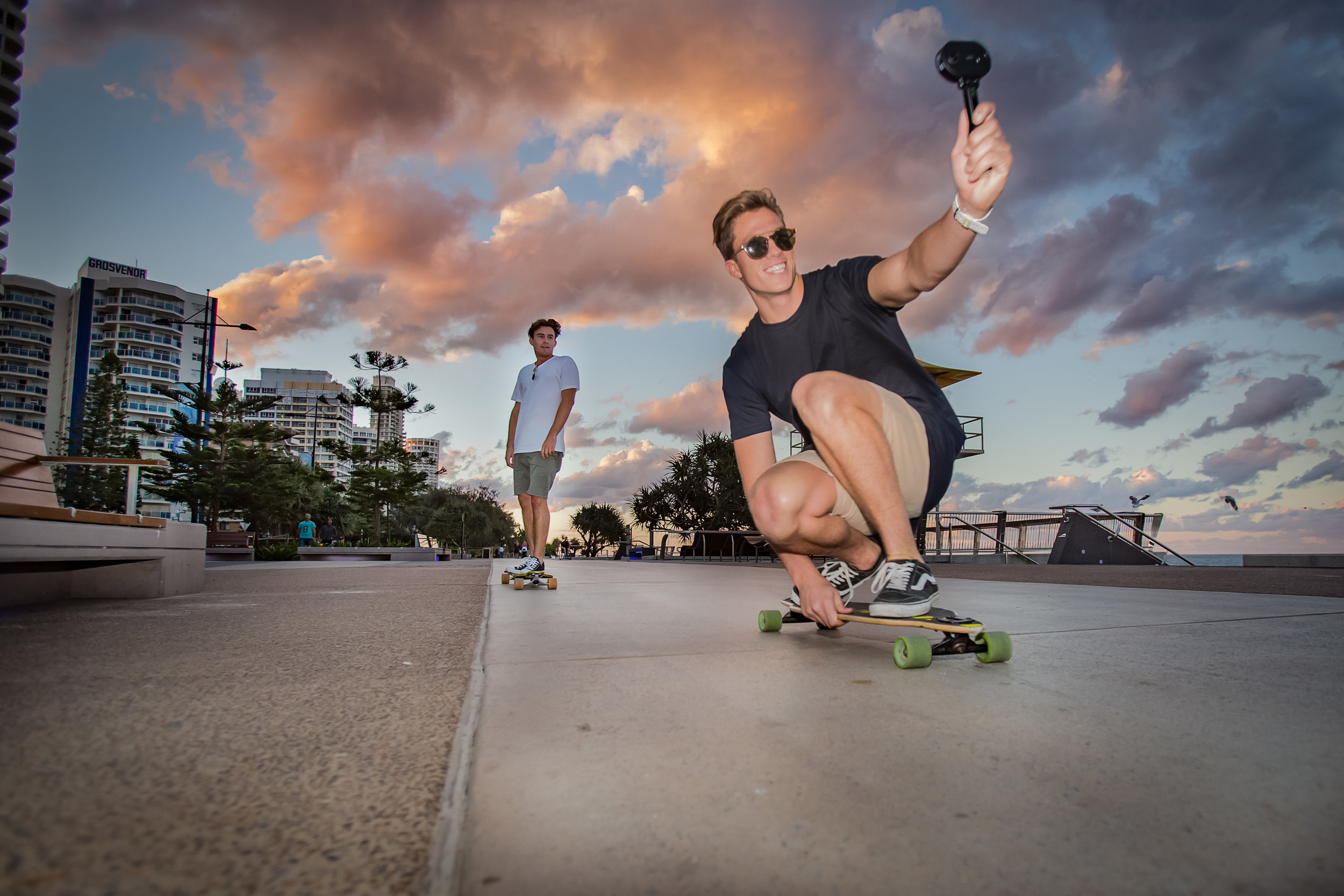
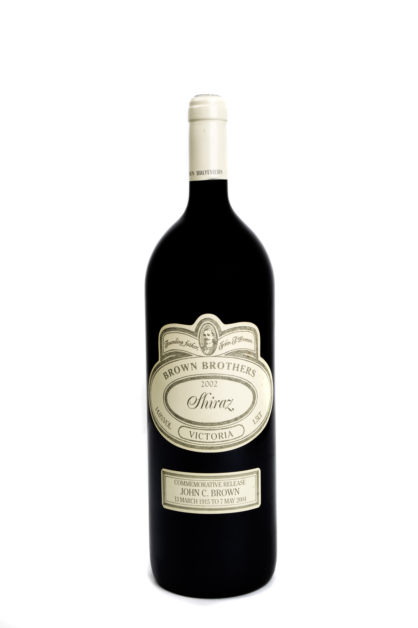
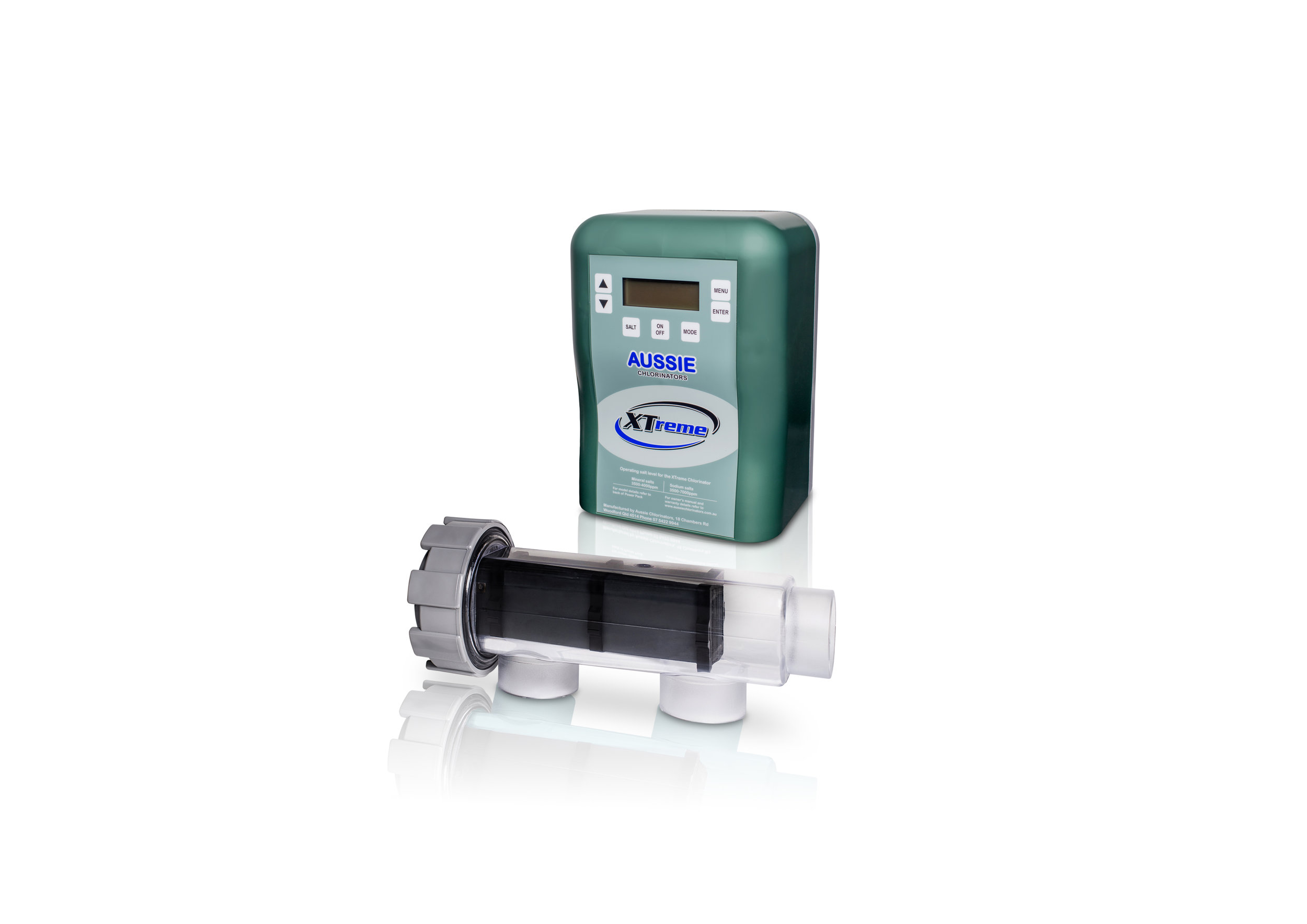
But many smaller and medium sized businesses don’t feel they have the budget for such things and instead think along the lines of the pure white background studio style catalogue product shot for ease and fast turn around.

And while that work also has a massive place in this word of internet shopping and online shop pages on a website, it’s well worth taking some time to think about what can be achieved with just a few drops of creativity, a little time and bringing on board the right people.

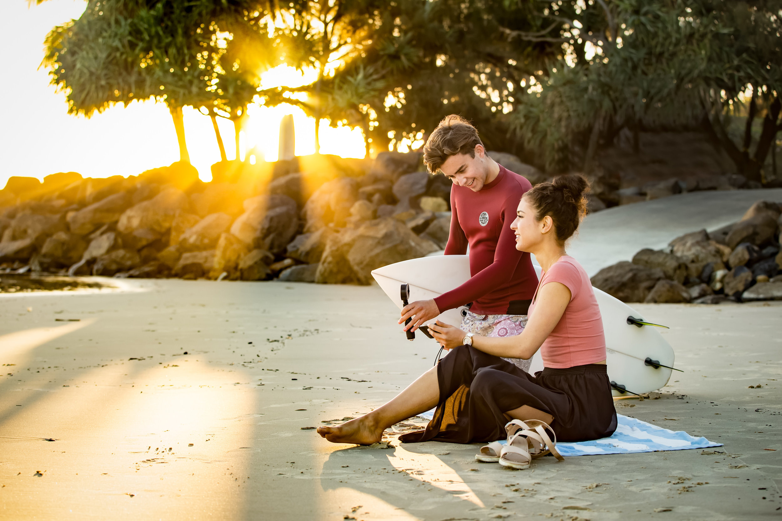
Lifestyle product shots are a classic way of pushing slightly out of the box to not only show the item itself but also build an emotional context around it and pushing the aspirational aspects of the product or highlighting its key points of difference in its market.

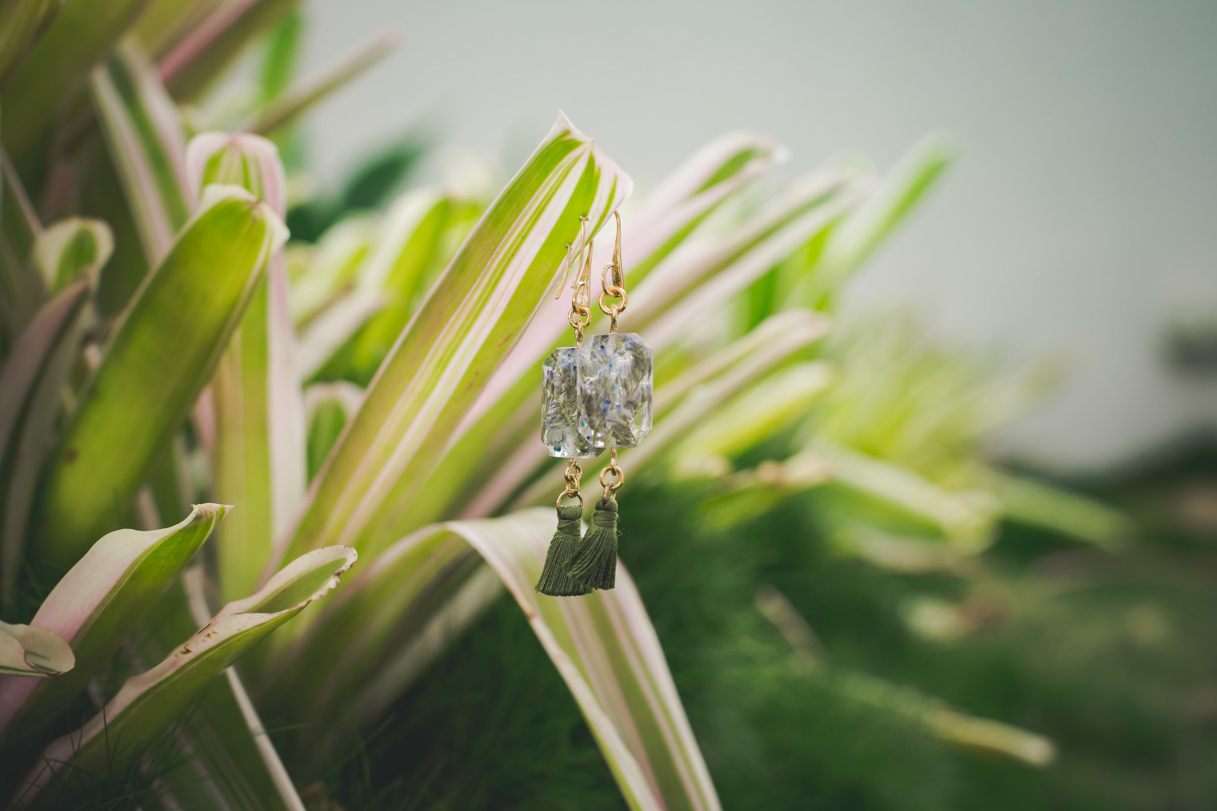
Emily recently undertook a shoot for a small local ‘one-lady band’ jewellery maker. Budget was tight, it would have been easy to do a simple in studio catalogue shoot but these beautiful pieces are individually hand dried flora encased in resin, freezing their beauty for all time.

 A sterile studio shoot seemed such a waste and so instead we celebrated the essence of the product and took it back to nature sourcing a beautiful roof top swimming pool garden in the CBD where we could work with models, the garden features and the sophistication of the surroundings to present the product in such a way that highlighted both the up-market luxury brand of the hand crafted pieces but also the organic foundation in nature.

Despite the lifestyle nature of the shoot the half day spent on location enabled us to create enough varied images to satisfy a wide range of usage from online selling store images to social media, website intro pages and general marketing material images.


Now you may be thinking, “hey that’s cool, but doing this with jewellery seems logical and quite easy… I make widgets, how do you get creative with that?”

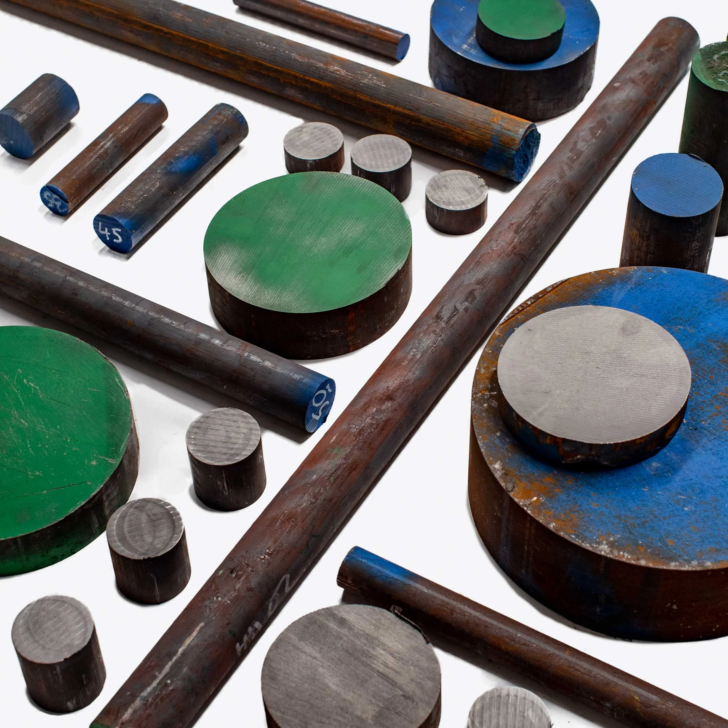
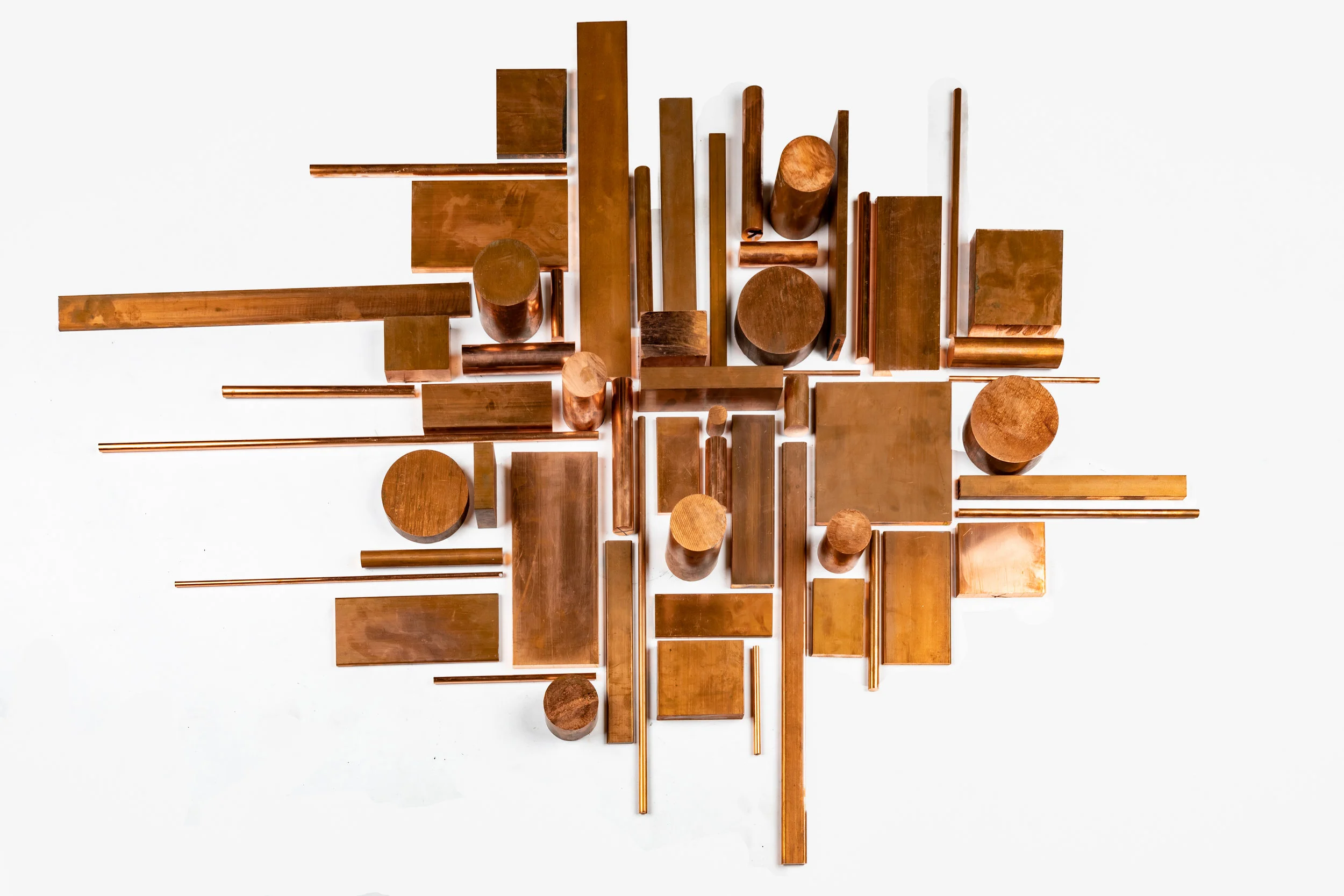
Well another recent shoot I (Andy) did was with a local metals company that sell metal bars and strips in copper, bronze, iron and so on. The initial meeting with the client went along the lines of “Yep we have these products and need a load of product shots which show it exactly as it is for the catalogue side of our website but we also want to do something more but we haven’t got a clue how to do that and we need ideas”. 

Essentially this company, like most of their competitors, were used to dealing with their standard clients in the construction industry etc who were very straight and linear in their approach. They need a piece of metal this circumference and this long and they want to simply see that the company has it and then they want to buy it (this is where the clinical studio product shot is king…. It shows exactly what is on offer).

But they also had realised that their customers were changing and now started to include architects, installation artists, interior designers and more artistic individuals who were buying metals direct or were becoming key influencers over there standard customers.

As a result they wanted images that could take them into a new zone where they could challenge the conventional look of their industry sector.

Wondering around their yards I found bins full of off cuts of all these wonderful metals, where in cutting the rods or cylinders, the insides had become amazingly burnished and beautiful and where the company saw scrap pieces I saw the most wonderful shapes and textures and reflective surfaces and thought, why don’t we use these off cuts to create artworks in their own right.

So, I thought, why not just lay a massive 3m x 3m piece of backdrop paper on the floor and then lay out all these different offcuts and scrap pieces into amazing geometric three-dimensional patterns of shape, reflection, shadow and light.

In my minds eye I could see the end result, but while I am an artist when I have a camera in my hand I am not great in other mediums…. That is why I have someone like Emily as my business partner, a new media, design specialist and photographer. She came on site and between us we created four three dimensional pieces of art in Bronze, Copper, Brass and Iron and then hanging off a high platform I photographed from above as single gigantic flat lays. Then we started moving around them and shooting from different angled exploring the shapes and forms we had created and from something that the client perceived as bland raw products and a slightly crazy idea, generated a set of wonderfully creative and artistic images in what became one of my favourite shoots of the year.

Catalogue style product photography is of course very necessary and has its place in your marketing and sales mix, but if you need some product shots done pause for a moment, find the right photographer, listen to where they might think about taking the concepts and you might find that some amazing things can be created on modest budgets that transcends the simple “this is what you get” and provides a range of images that can be used through multiple marketing channels and create that extra little bit of magic around your brand.

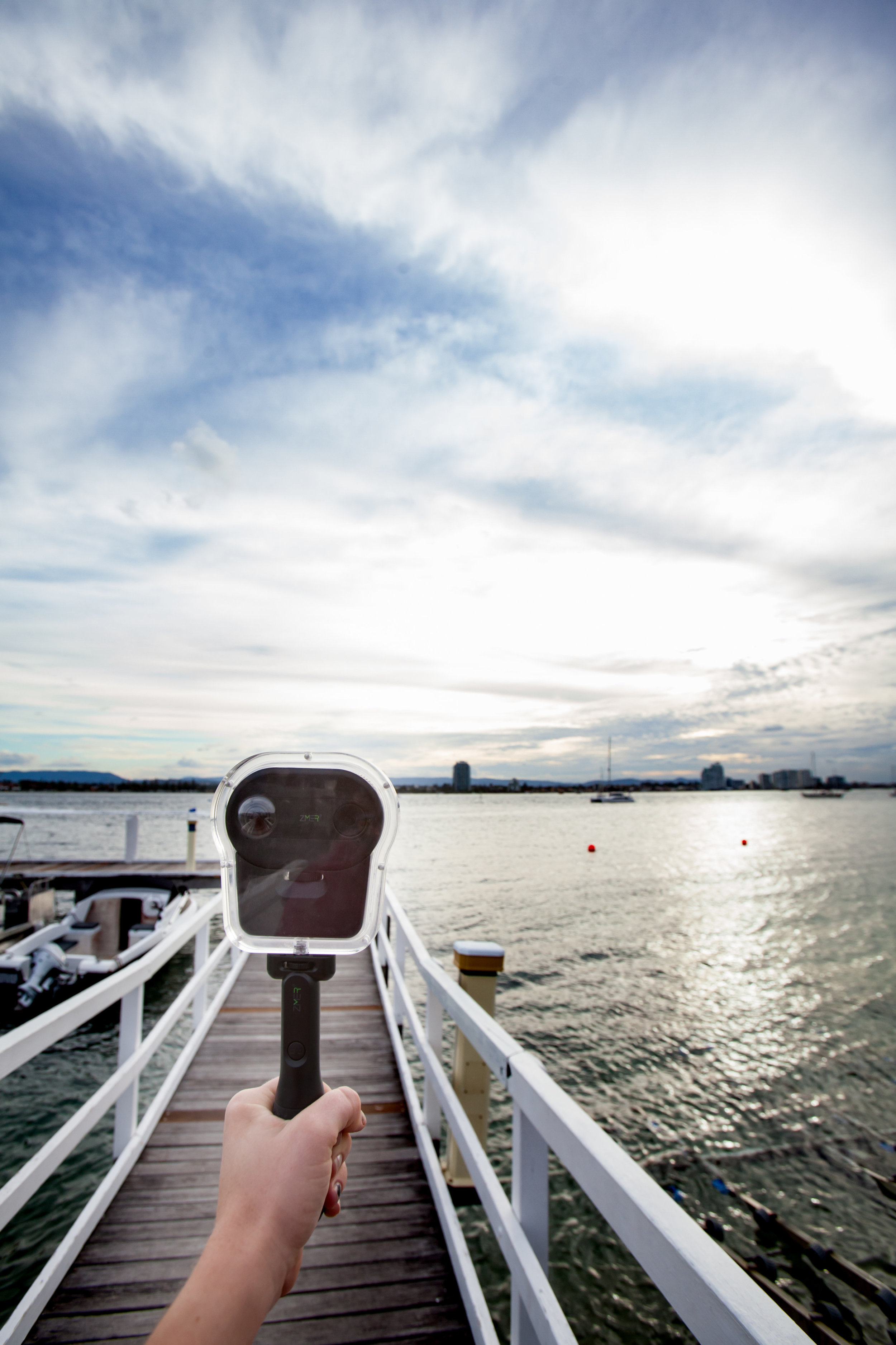
Whether we are shooting a new action camera or a lump of metal, we always try and think beyond the box…..

Brisbane Commercial Photography | Brisbane Product Photography | Brisbane Corporate Photography